In both supermarkets and specialist outlets, the clarity of a department is an immediate performance driver. A customer who can't find what he's looking for means a lost sale. A fluid shopper journey, on the other hand, increases the likelihood of purchase, enhances the value of high-margin products and improves the in-store experience.
But how do you energize a department so that it becomes legible, engaging and effective? What are the best merchandising practices for structuring a space that attracts the eye and facilitates decision-making?
Here are 5 concrete ways to optimize your shelves, improve shelf visibility and help shoppers make the most of their shopping experience.
1. Work on visual shelf segmentation
We don't optimize a shelf to make it look good, but to make it speak to the customer. A good shelf is one that attracts, directs and transforms. To achieve this, we need to structure our offer according to a shopper logic, i.e., according to needs, consumption moments or uses.
A few examples to illustrate:
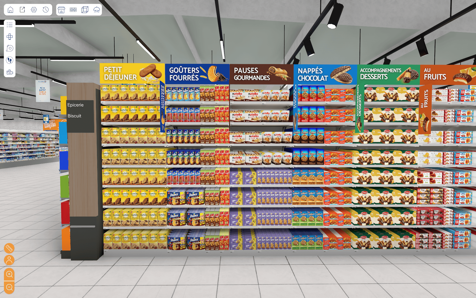
- In a cookie aisle: segment by type (breakfast, filled snacks, gourmet breaks, cookies, chocolate-covered, dessert accompaniments, fruit, classics, plain cookies).
- In a DIY department: group products by project (repairing a leak, installing a shelf, repainting a wall...).

Visual segmentation is essential: shoppers need to be able to quickly identify a product or category, or risk frustration. Here are a few simple examples that store managers can draw on:
- consistent color codes,
- physical separators,
- legible identification labels,
- explicit visuals, ilvs, dynamic screens or tutorials.
The aim: to create distinct universes to guide customers naturally to the right zone.
2. Clarify markings and signage
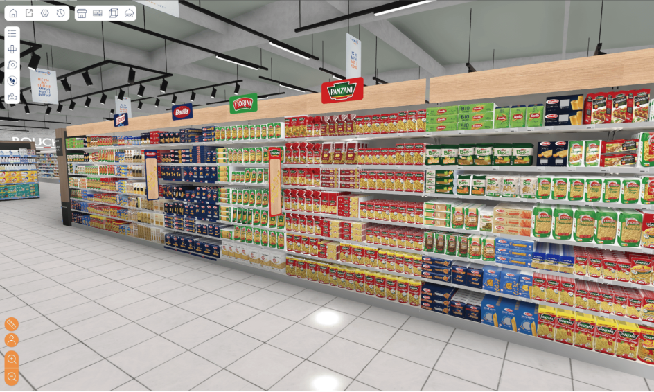
Good linear signage captures attention in a matter of seconds. Signage must be visible, legible, coherent... and above all, useful.
Avoid redundant, poorly placed or too many supports, which create "visual noise" and saturate the shelf. As is often the case, less is more. Here are a few more practical tips to follow.
Best practices :
- A clear pediment with the department name (e.g. "Organic face care").
- Category bands structure the shelves.
- Pictograms for quick visual cues (organic, local, gluten-free, etc.).
- Well-positioned promotional displays that don't obscure the permanent offer.
Ideally, you should test your signage before installing it, as it's a considerable expense. Here's a tip: test with 3D merchandising. Testing different types of signage in a virtual environment enables you to visualize the real impact on the customer's experience before going to production.
%20(1).png)
3. Work on the shelf visibility of flagship products
A high-performance shelf doesn't show everything in the same way. It highlights strategic products:
- what's new,
- high-margin products,
- bestsellers,
- innovations.

To achieve this, we need to master linear visibility, i.e. the way products are seen according to their position in the cabinet:
- The 3-height rule: eyes, hands, feet.
→ High-turnover products should be between the eyes and the hands. - Facing: multiply the width of products to make them more visible.
- Hot zones: end of gondola, top of cabinet, top of shelf.
Occasional theatrical displays (bins, podiums, window displays) can complete the dynamic, but must remain legible and coherent with the department as a whole.
4. Use 3D tools for simulation and testing
In an ever-changing retail environment, it's expensive to physically test each new store layout or animation.
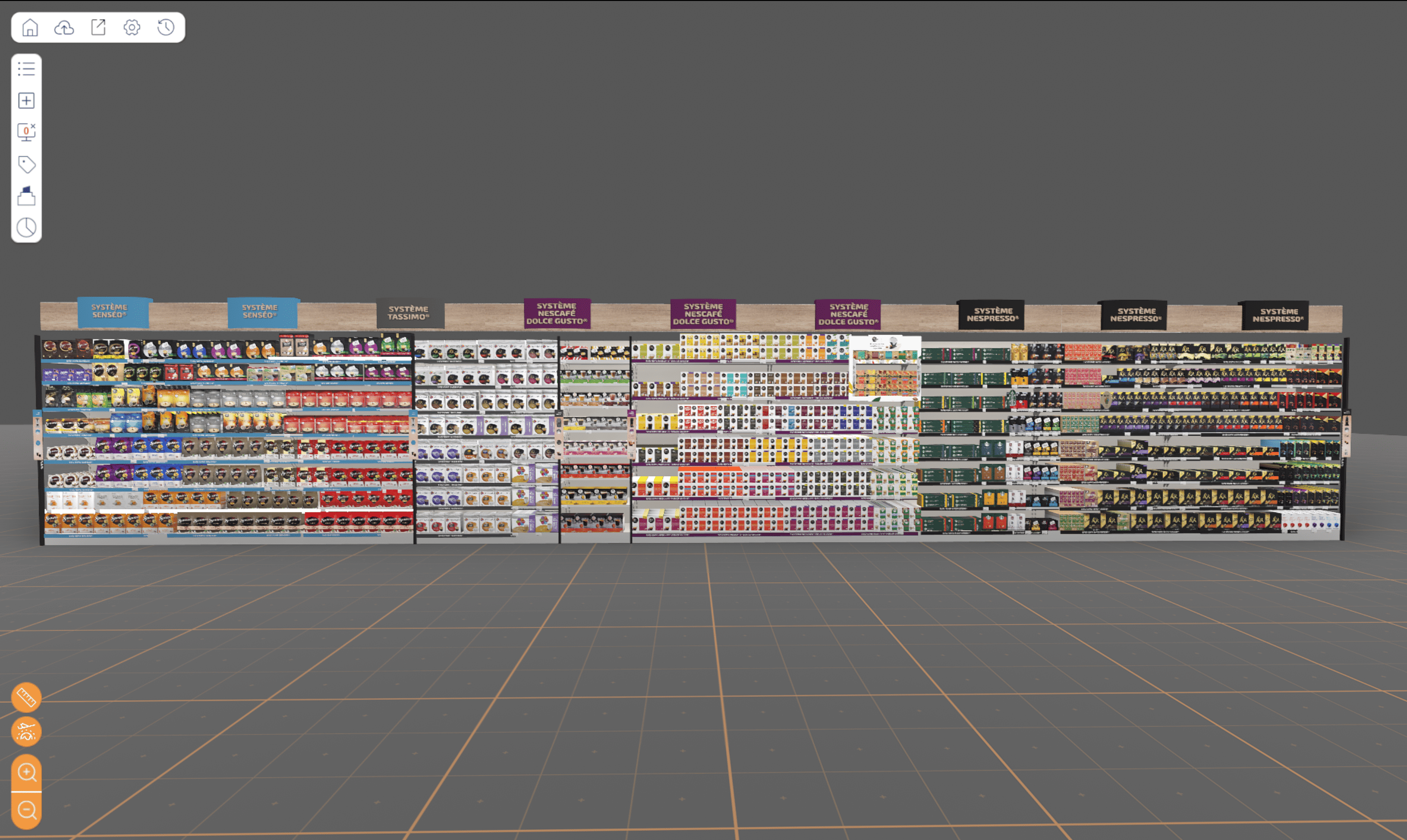
This is where 3D merchandising comes in. Thanks to digital point-of-sale solutions, brands and chains can :
- model their radii in realistic 3D,
- test several product implementations,
- validate the legibility of point-of-sale displays,
- simulate the shopper journey and the real field of vision.
These tools make it possible to anticipate areas of confusion, shorten validation times and enable more effective collaboration between head office, category managers and field teams.
Example: Nestlé uses a 3D visualization solution to deploy its merchandising strategies in France and abroad faster and more effectively.

5. Adapt layout to different types of outlet
What works in a 3,000 m² hypermarket won't be relevant in a convenience store or downtown drugstore.
Each store format calls for a specific merchandising strategy:
- Lower density in proximity = priority to clarity and speed.
- High breadth of offer in hypermarkets = importance of zoning, segmentation and signage.
- In DIY stores or specialized channels = greater role for visual advice, product explanation and education.
By adapting the presentation to each context, you improve the shopper experience without compromising your national strategy. Immersive tools facilitate these local adaptations while ensuring global consistency.
Conclusion: a clear aisle means a winning customer journey
A good shelf is more than just aesthetically pleasing: it's legible, logical, engaging and profitable. It anticipates shoppers' needs, facilitates choice, promotes the right products and supports sales strategy.
The 5 key levers for optimizing your shelves :
- Clear visual segmentation
- Well-thought-out signage and wayfinding
- Intelligent promotion of flagship products
- A 3D merchandising simulation to test and iterate
- Adapting to store formats
By investing in a structured, tool-based approach, you can turn every linear metre into a lever for growth.
Why not take action?
Retail VR can help you digitize your shelves, create immersive shopper journeys and 3D model your merchandising concepts.
Request a free demo with one of our experts

.png)


.webp)
.webp)
.webp)